Style sibling elements without using JavaScript
It is often necessary to change the style of a sibling element when a user-induced event occurs on the DOM. As an example, changing an icon when a user clicks into an input box (the onfocus event). It's trivial to change styling with certain events using CSS and pseude-classes (for example hover, focus, active, and visited) for the element itself but what if we want to change a sibling element when we have a onmouseover or onfocus event (which would trigger the CSS pseudo-classes hover and focus).
Well, it turns out it's actually quite easy although there are a few things to remember.
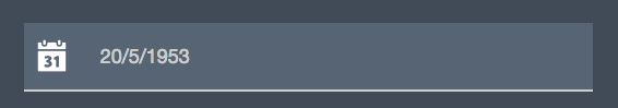
First, to give you an idea of what we want to do, let's look at the html of an example where we are trying to capture a user's birthday. We have a div with a nested input and a nested icon of a calendar. We are using icons from the Foundation icon library in this example but you could use any icon set.
  <div class="birthday">
    <input name="birthday" class="birthday-input" placeholder="20/5/1953">
    <i class="fi-calendar birthday-icon"></i>
  </div>
Here's what that would look like once we've styled it and arranged the elements to be side by side using relative and absolute positioning.
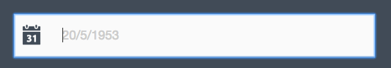
The design calls for the input box background-color to turn white when the user clicks into it, but that would render the icon not visible as it is already white. So we want to change its color when the hover pseudo-class for the input it triggered. Here's what the input and icon need to look like when the user clicks into the input. Note the color change of the calendar icon.
This can all be accomplished with CSS. First, the CSS without the bit that will change the icon color when we click into the input.
body {
  background-color: #414B56;
}
.birthday {
  position: relative;
}
i {
  top: 0;
  left: 30px;
  position: absolute;
}

input {
  padding: 20px 5px 20px 60px;
  font-size: 30px;
  background-color: #6D7B8A;
}
input:focus {
  background-color: white;
  color: #333333;
}
i {
  font-size: 50px;  //set the size of icon
  color: white;     //set initial icon color
}
And now, the little bit of magic that allows us to change the sibling element.
input:focus + i {
  color: #414B56;
}
The magic is in the + between the input:focus and i which basically says to only style i if the input focus pseudo-class is active.
It should be noted that the + selects the immediatly adjacent element while using ~ instead will search through sibling elements that follow the target element. This technique will not work in CSS3 if the icon is before the input in the html so take note of that although it may become an option in future versions of CSS.
How do you do this in Sass?
It's actually quite simple. To use the Sass (or Scss which is the latest version of Sass) CSS pre-processor, make sure you first have it installed in your project. Then, here the simplified CSS that deals with the input and icon only.
input {
  color: $white;
  background-color:  lighten($atomic, 10%);
  &:focus {
    color: $jet;
    background-color: scale-color($white, $lightness: -2%);
  }
}
/* set the icon color to atomic when user focuses on input */
input:focus + i {
    color: $atomic;
}
But what in the world are those colors that are named and start with a $? Now we are getting into the beauty of Sass and the ability to use variables.
In this case, I've previously set these variables like so:
$white           : #FFFFFF
$jet             : #222222;
$atomic          : #414B56;
So now I can use these variables anywhere I want. One other thing to point out before this blog post ends is that you can lighten or darken colors by % very easily using Sass. The syntax to lighten for example is shown on line 3 above and to darken, we would simply replace lighten with darken.